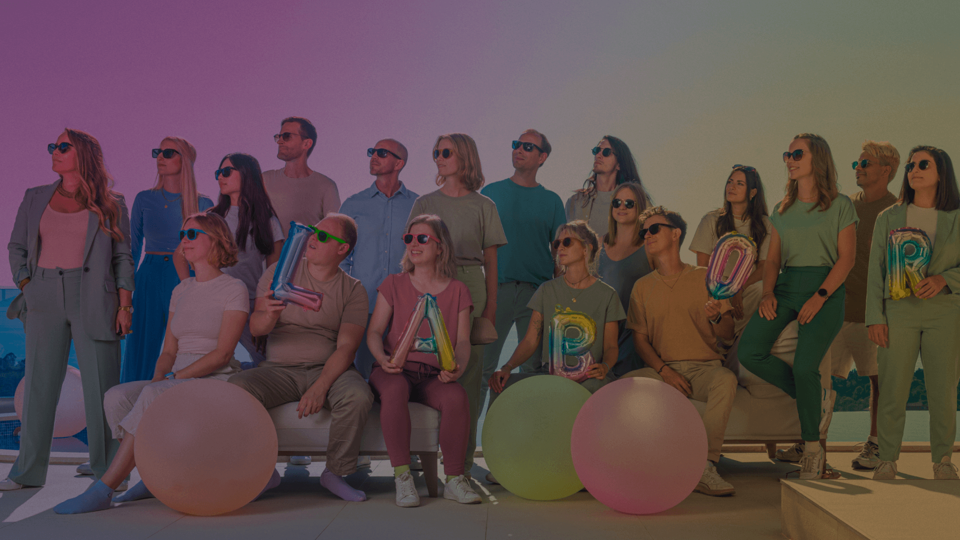
As the saying goes, it should take 10,000 hours to get really good at something 🙄. Since 2001 (20 x 10,000 hours 😊) we have been working on digital solutions, gaining experience in working with major customers, medium-sized companies and start-ups.
We use this expertise to provide new customers with the best possible advice.
The heart of a digital agency is its employees - yes, like everywhere else 😊... but especially in the area of development we have a strong team that can implement the wishes of our customers at the highest level 😉
Buzzwords: DevOps, Full-Stack, SPA, TYPO3, Cloud-Hosting...
☝️ all terms behind which the idea is to create visibility and ultimately sell a product or communicate a service. This can be important in conjunction with a website development or developed separately as an independent campaign.
Here you need a good concept, creative visuals, suitable texts and a realistic media budget 😊.
Content is king, social media is the new internet - there is a lot of truth to that. Whether with professional LinkedIn articles, YouTube videos or retargeting campaigns on Instagram - you can reach the desired target group on social media, but for that you need a content pipeline, good ideas 💡 and the right storytelling.
That's why our social media team is bigger, increasingly important and well received by our customers.
🙏 Go Team SoMe!
Many of us have the heart 🧡 of a designer who may also be a UX designer, creating the interface of a website or developing an email campaign - the principle remains the same.... good design, appealing headlines, images with impact ✊ make the difference.
The teamwork of our designers and developers is not always easy 😊 ... but always guarantees a good result.
/ Creative Campaign / Adobe WFAC / Sponsorship / Marketing Campaign
Open projectOpen projectProjects: Branding for Adobe's sponsorship of the Women's FA Cup.
The main challenge was to merge the existing FA corporate design with the Adobe branding. The result is a colorful, dynamic key visual that showcases both the individual players and the partnership.
Lorem ipsum dolor sit amet, consectetur adipiscing elit. Suspendisse varius enim in eros elementum tristique. Duis cursus, mi quis viverra ornare, eros dolor interdum nulla, ut commodo diam libero vitae erat. Aenean faucibus nibh et justo cursus id rutrum lorem imperdiet. Nunc ut sem vitae risus tristique posuere.
View Project/ Creative Campaign / Adobe WFAC / Sponsorship / Marketing Campaign
Open projectProjects: Branding for Adobe's sponsorship of the Women's FA Cup.
The main challenge was to merge the existing FA corporate design with the Adobe branding. The result is a colorful, dynamic key visual that showcases both the individual players and the partnership.
/ Creative Campaign / Adobe Acrobat / German Market / KollonneNull / Full Funnel Campaign
Open projectProjects: Full Funnel Digital Campaign for Adobe Acrobat.
The challenge was the on-brand adaptation to Adobe's new Project RED guidelines within a tight time frame.
/ Creative Campaign / Adobe Express / UK / SMB Use Cases / Full Funnel Campaign
Open projectProjects: Adobe Express Marketing Campaign for the UK market.
The challenge was to implement diverse, creative approaches while taking into account the different characteristics of the partnerships under increased time pressure.
/ CI Facelift / Corporate Shooting / Website Relaunch / Prototyping / Web Development / CMS / Strapi
To the website/ Photoshop Campaign Europe / Animation / Social Media & TV Spots / Cinema 4D / Everyone can
To the website/ Adobe EMEA Campaign / Creative Cloud Promotion / Social Media Assets / Animated Ads
/ Visual Concept / Adobe Express / Generative Fill / Firefly / Lifecycle Marketing
Open projectProjects: Lifecycle marketing campaign on AI using Adobe Express.
In a lifecycle marketing series to activate existing customers, the new AI features of Adobe Express are presented in a playful way. The main challenge is to arouse interest through appealing use cases and to demonstrate the topic of AI in a simple and appealing way.
/ Visual Concept / Automotive / Prototyping / Promotion Assets / Social Media Assets
To the website/ Lead Strategy / Performance Marketing / TYPO3 Website / SEO
To the website/ Social Content Strategy / Storyboarding / Creative Writing / Motion Design / Listicle Format / LinkedIn Ads
View ListiclesProjects: Listicles on Siemens Smart Infrastructure
The combination of list and article is a.... Listicle. Siemens hired us to translate content from the area of Smart Infrastructure into this format. The challenge is to adhere to the Siemens CI while at the same time developing a new, appealing format. The content is played out on LinkedIn as an animated teaser and a follow-up expert article.
How do you make the leap to a perfect #energy footprint? 🌱 In addition to a green footprint, smart #energy solutions also offer strategic advantages for your company. Roland Schmidt, Head of Energy Performance Services, reveals 3️ tips on how to optimize your energy balance:
LinkedInPost | LinkedIn Article
Learn how to understand your building data💡. At #SymposDigital21 on June 8, we'll show you how complex data becomes #SmartData and helps your building become intelligent, efficient, and attractive. #SmartBuildings
Up to 50% of the energy consumed by #buildings and infrastructure is used inefficiently. 😳 Here are 3 reasons why buildings should be optimized! 👉
/ Prototyping / Adobe Styleguide / Responsive Emails / Inbox Detection / Open Rate
View email/ website relaunch / photo shooting / workshop / Typo3 / redesign / accessibility / SEO
All project info hereProject: new website in Typo3 // Content Creation // Workshops
The project
From old to new: Due to the rapid growth of the still young TH Aschaffenburg, the university's website had to meet many new requirements in a short time. There were also new technical requirements and a need for optimization, for example with regard to accessibility, responsiveness and search engine findability. In addition, it was time for a refresh of the visual and formal language of the website. Having already changed its name from Hochschule Aschaffenburg to Technische Hochschule (TH) Aschaffenburg in 2019, a new website was to be created in 2020.
The objective
A central role in the project was played by communicating the core competencies and umbrella messages of TH Aschaffenburg. From these, we derived recommendations for action. Particularly relevant for the university are the core themes of "professional competence," "high teaching quality," as well as "practical relevance" and "family-like" interaction. In order to anchor these values fundamentally in the offering, the content of the website in which the values are reflected was particularly relevant:
The goals of the new website were to present the content in multimedia form. Within a clear structure, the different areas of the university were to be represented equally.
In addition, the site as a whole was to become more interactive, personal, and modern. Stephan Powilat summarizes TH Aschaffenburg's vision as follows: "The university wants an attractive, contemporary website that complies with data protection regulations. It should offer a clear information architecture and intuitive access for its core target groups."
The procedure
We began implementing the project in mid-2020. In several workshops, we initially developed a requirements profile with the university's employees. By involving as many university employees as possible in the development process from the start, we increased the university's acceptance of the upcoming relaunch and thus prevented the impression of an elite project. In addition to the university website (www.th-ab.de), there was also a "Studying in AB" site on which the university presented its degree programs. The new website was to combine the content and design elements of both previous websites.
An editorial system was designed with the help of the design thinking approach. Together with a partner agency, we conducted training sessions for all employees who will be responsible for editing the new website in the future. In several workshops, we worked with the future editors on the basics of "good copy writing on the web". The topic of accessibility was also taught to the employees with the help of several exercises.
Parallel to that, the development of the Typo3 website focused on the usage habits of the main target groups. That's why we opted for a "mobile first" approach, prioritizing the optimization of the user experience on smartphones and tablets over other devices. For contemporary, authentic visuals that reflect the values and messages of TH Aschaffenburg, we conducted a photo shoot with staff and students.
Due to our young team, we were able to easily empathize with the main target group of possible students. In doing so, we were able to use our experience and knowledge with TH Bingen as a long-standing customer in the higher education sector to
benefit. This made it easy for us to make the right decisions in terms of university marketing, from the conception to the implementation of the project.
Result and Outlook
In the beginning of March 2022, it was time: After 1.5 years of development, the new website of the TH Aschaffenburg went online. For us, however, this day does not mean the end of the cooperation with the university: We will continue to provide the TH Aschaffenburg with expert support for the ongoing operation of the website.
For us, the project with its many different subtasks was a challenge with ups and downs. In the end, the project team mastered the relaunch with ease. Managing Director Stephan Powilat draws a positive conclusion: "We are pleased that we can support the TH Aschaffenburg with the relaunch of the website and a new concept and give their marketing new momentum.
If you have not yet visited the TH Aschaffenburg website, you should definitely do so. Here you can go directly to the site.
/ Property Financing / YouTube Marketing / Video Production / Lead Generation / Performance Marketing
YouTube Channel/ Culture & Education / Local Hero / New Corporate Design / Website
To the website/ start-up / own product / corporate design / photo shoot / social marketing / website / heart project
Visit Tiny Art/ Education / E-Learning / Illustration / Motion Design / International
View ProjectProjects: Adobe Young Learners - Google Docs
To make digital teaching a success, we have developed a series of distance learning templates for our long-term partner Adobe. Teachers can fill these with tasks and pass them on to their students.
A colorful appearance has a motivating effect and appeals to students of all ages. Unique illustrations make the templates stand out clearly from other online learning tools.
Subtle animations and individual details give the illustrations a unique look that is highly recognizable. The characters also reflect the diversity of the students, as the templates are intended to be used by teachers worldwide.
Each subject area has its own color scheme and is recognizable by an animated icon. This icon style also serves to graphically highlight the individual categories and to structure the task more clearly.
/ Annual Meeting / Cancer Research / Website / Online Marketing / Corporate Design
View Project/ Video Production / Motion Design / Adobe Studio / Video Marketing
Watch VideosWe like to be well prepared for a first meeting, so it helps to have some preliminary information.
Once we receive the form, we will process the request and get back to you in a timely manner.
Find out more about our agency and stay up to date on Instagram and our other channels.
Founding a company with friends - sounds exciting, doesn't it?🤩 Florian co-founded LABOR and reveals his tips for successfully mastering the start-up as friends! 🤫 ☄️
The rich text element allows you to create and format headings, paragraphs, blockquotes, images, and video all in one place instead of having to add and format them individually. Just double-click and easily create content.
In October we are heading to Croatia and dare the adventure of a Workation 🤩. What awaits us and what we expect? Hopefully lots of sun and inspiration for our work! Check out our LinkedIn post for more info about our trip to Croatia.
Making abstract topics tangible? Challenge accepted!😎 We support Hüttig & Rompf AG in their web presence. This also includes the YouTube channel "Property financing made easy", which we set up 2 years ago! 🎉 Why this fits perfectly? Read for yourself!
In this article, we share five key learnings that we made with our customers from the education sector. So it's worth reading on ☝
Founding a company with friends - sounds exciting, doesn't it?🤩 Florian co-founded LABOR and reveals his tips for successfully mastering the start-up as friends! 🤫 ☄️
In our digital agency we value the collaboration with our clients 👌 - but there are also our own product ideas that we realize here 🚀 and today I would like to present a very special project:
TINY ART - from a child's drawing to an artprint 😉
By Stephan Powilat
I would like to give a brief overview of how we address the following issues for our customers:
What a time to be alive...
Some readers will have heard of NFT. About the crazy sums that are paid for digital art. About the artist Beeple, who fetched almost EUR 60 million at Christie's with a pixel painting. Wait, what??
YouTube will no longer run ads with controversial content in the future - including political topics. The regulation applies to the popular masthead space.
Subscribe to our newsletter now and get the latest news from LABOR in well-dosed units 😊.
Project Management